


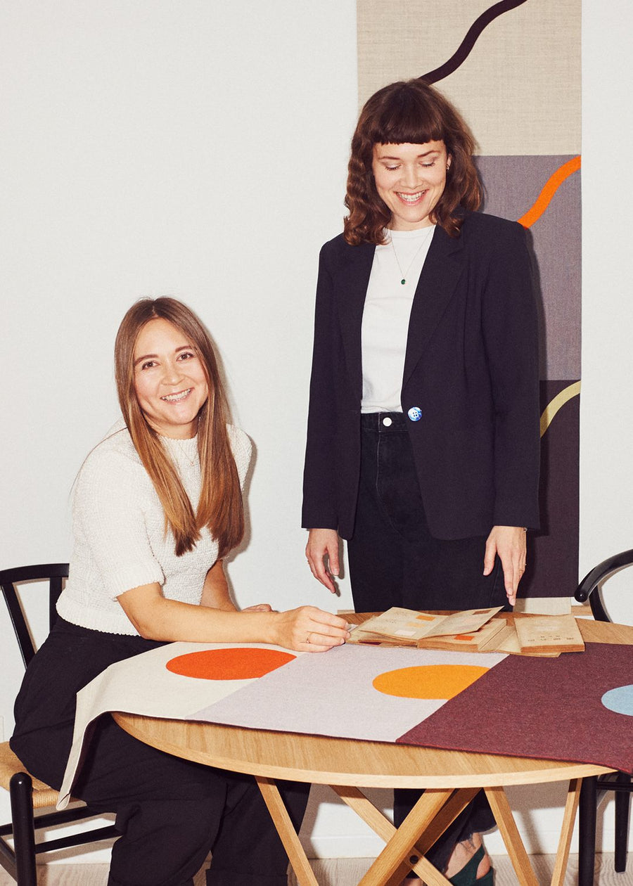
Hvass&Hannibal
Hvass&Hannibal is the Copenhagen-based studio of Nan Na Hvass and Sofie Hannibal, who have collaborated since their student days at the Royal Danish Academy of Fine Arts. Across two decades their shared visual language has spanned album covers, stage design, illustration and exhibitions. Their prints distil ideas into pared-back, abstract compositions, drawing on Bauhaus, Japanese textiles and traditional crafts, using screen printing, photogravure and risograph. At their core lies a fascination with colour and its emotional power.
About Hvass&Hannibal
A Shared Visual Language
Nan Na Hvass and Sofie Hannibal are the creative minds behind Hvass&Hannibal, a Copenhagen-based studio where art and design intersect. Having worked together since their student days at the Royal Danish Academy of Fine Arts, their collaboration spans two decades and a wide array of disciplines – from album covers and stage design to illustration and exhibitions. Their print work is an extension of this shared visual language, distilling ideas into pared-back compositions rooted in abstraction and guided by a strong sense of colour.
“Now our motifs are simpler and more graphic, but remain grounded in forms found in nature.”
Drawing inspiration from Bauhaus, Japanese textiles and traditional crafts, their recent work favours geometric shapes, rhythmic balance and graphic simplicity. Alongside screen printing, they experiment with techniques such as photogravure and risograph – processes that allow for both precision and unpredictability.

Colour as Emotion
At the core of their collaboration lies a mutual fascination with colour and its emotional impact. Rather than focusing on subject matter, their creative process often begins with palette – experimenting with how unexpected combinations can spark a specific mood or energy. In their Colour Meditation series, they spent days fine-tuning the relationships between hues until each composition felt instinctively “right” – a feeling that, for them, goes beyond explanation.
“We’re fascinated by how colour can evoke emotion – how a palette can feel surprising, unsettling, soothing or calm.”
Hvass&Hannibal describe colour as a spatial force – something that can transform a room, create harmony or stir tension. Their artworks play with this potential, offering viewers a moment of stillness, stimulation or surprise through the arrangement of shape and shade.
Portrait by Dennis Morton
Discover Art By Other Artists
Explore art from a wide range of artists, discover new arrivals, browse bestsellers, and see our curated picks.


Canvas


Bestseller


New Arrival
Curator's Pick


Canvas


Canvas


Canvas


Bestseller


Curator's Pick
Canvas


Bestseller


Curator's Pick


Canvas


Canvas


Bestseller


Bestseller


Bestseller


Canvas


