Sarah Hartmann
Curated by
@saraheartmann
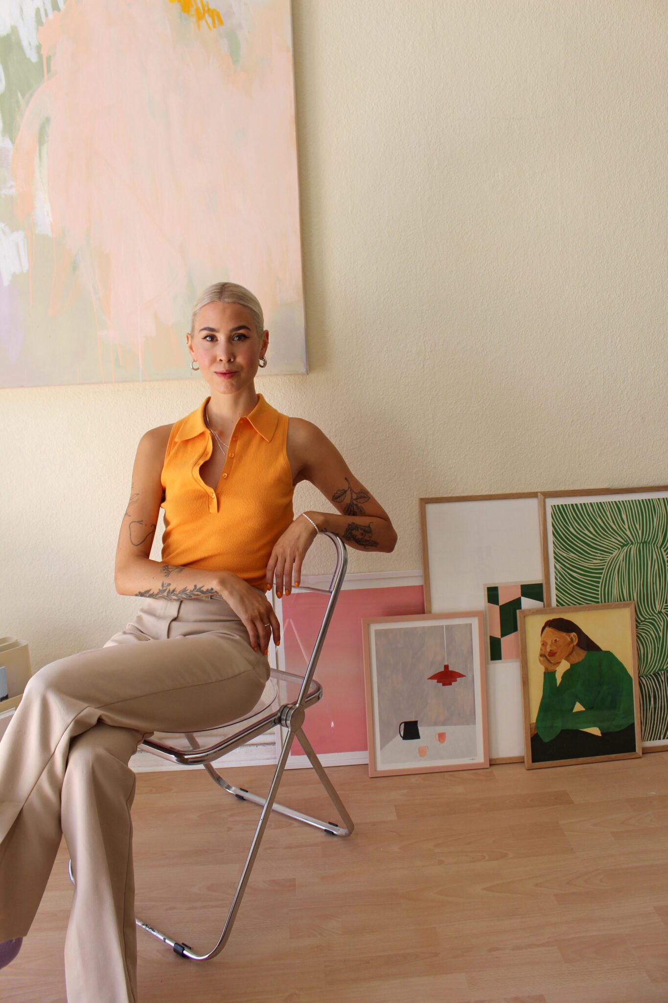
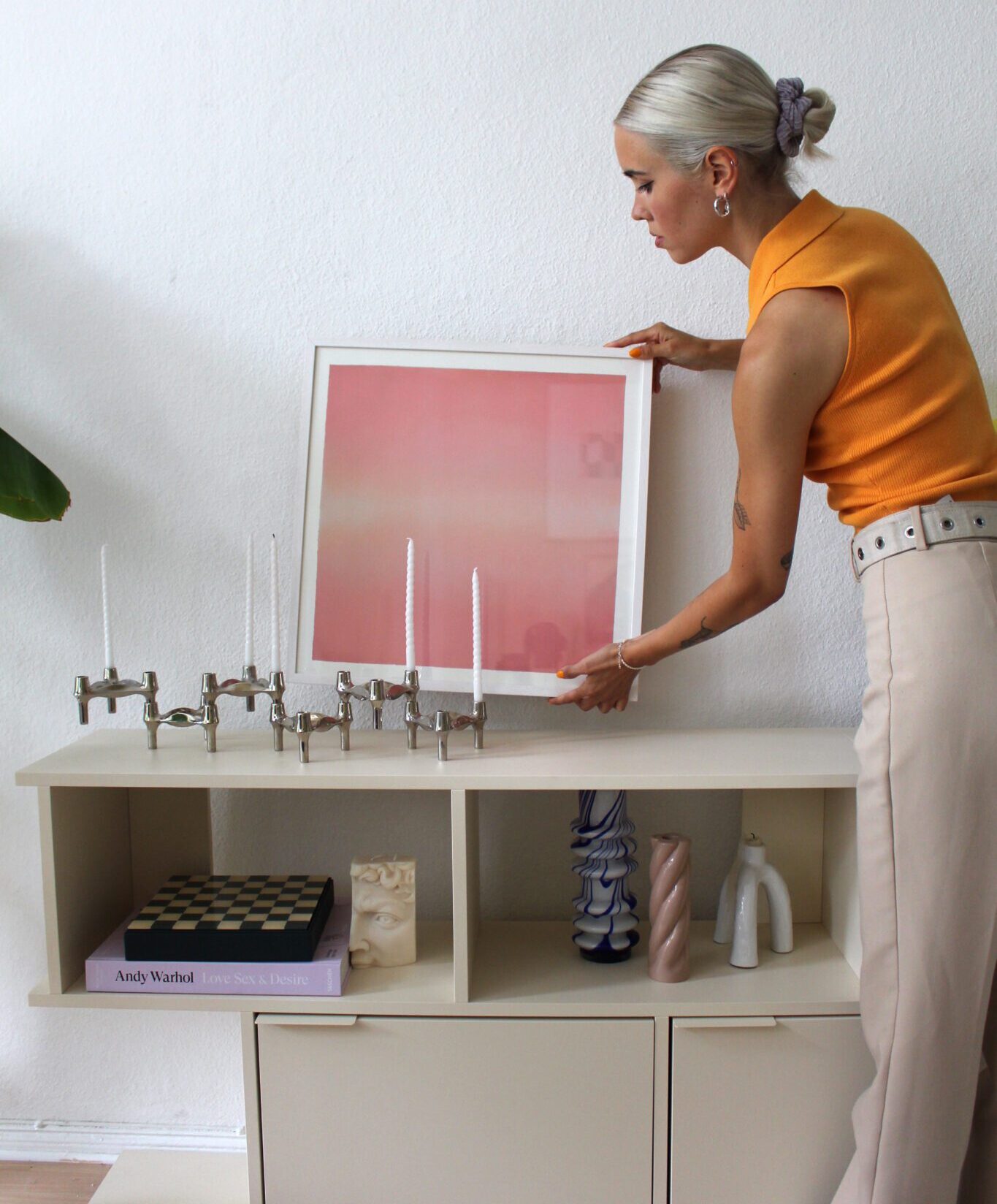
Being surrounded by colours and patterns is the ultimate mood booster according to designer and DIY’er Sarah Hartmann. Inspired by the joyful colours of the 70s, Hartmann has created a home of warmth and light. Her playful personality shines through in her curation of five art prints.
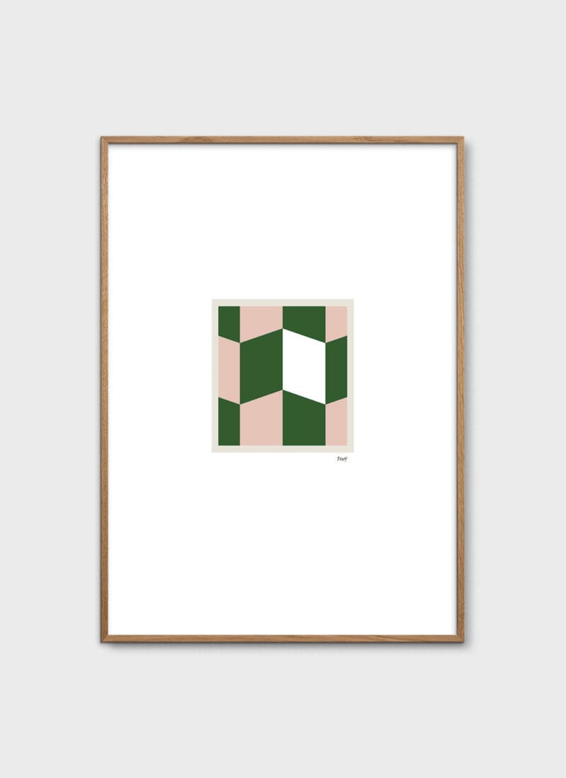
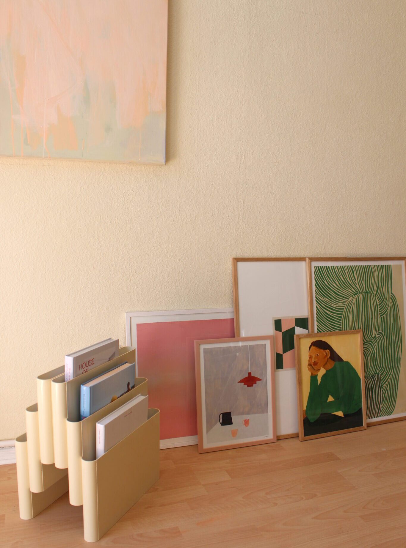
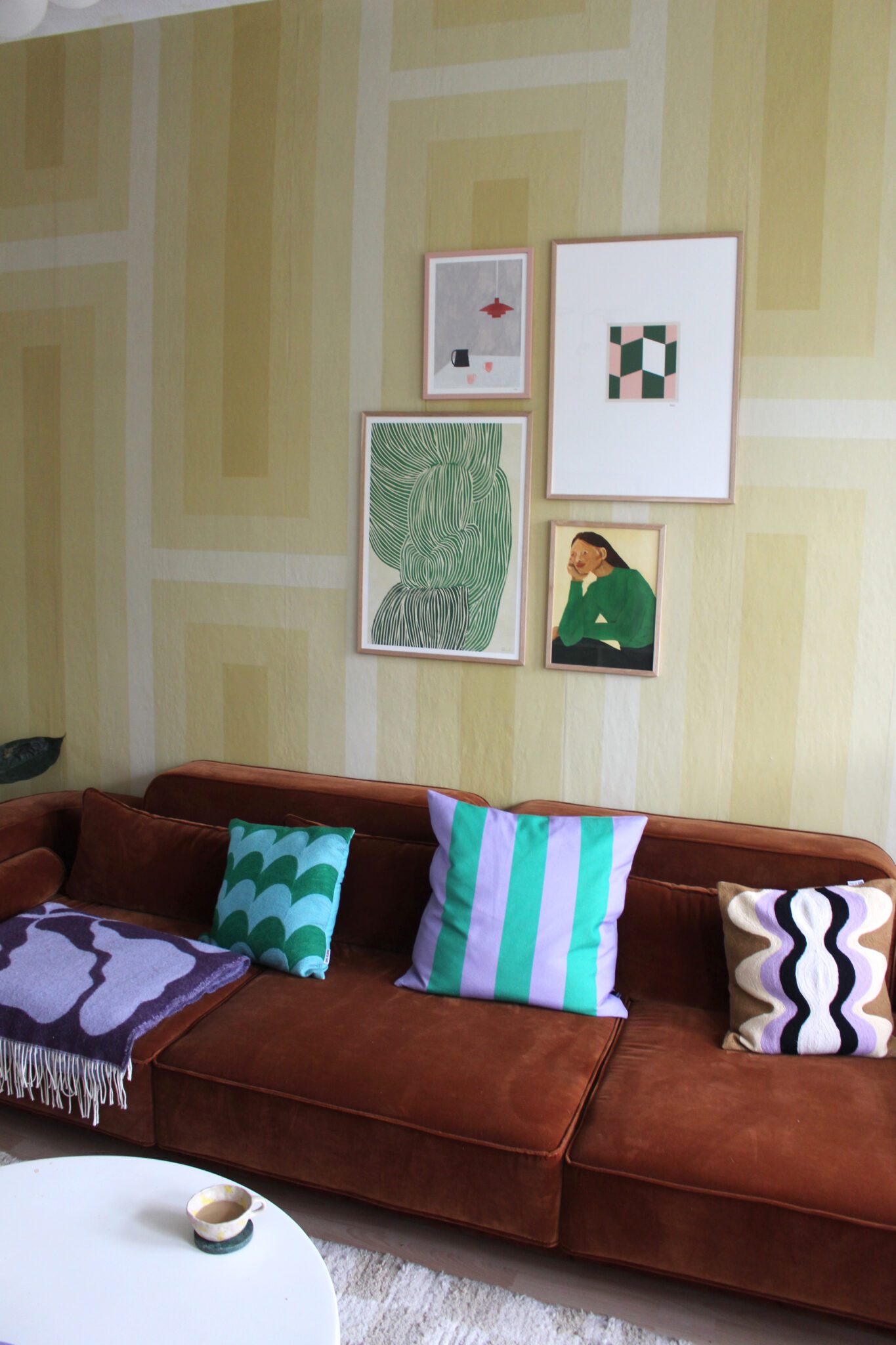
“I really like the shade of dark green in combination with pink tones, which is why I went with Window No. 03 by Mille Henriksen.”
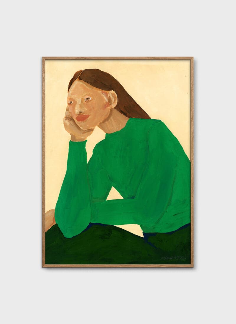
Hartmann used this colour scheme to match the rest of the art prints. However, her absolute favourite print is Green Guise by Hanna Peterson: “It gives my little gallery wall a face which makes it more personal, and especially because I would also totally wear this bright green shirt.”
Featured Products